Rounded corners are small. But they carry a big design punch. They can make a button feel friendly. They can make a card feel soft. They can make an app feel modern, calm, and easy to use. In UI and graphic design, radius corners are not just decoration. They are part of how people read, tap, and trust your design.
TLDR: Rounded corners help designs feel softer, cleaner, and more modern. Use them with purpose, not by accident. Keep corner radius values consistent across buttons, cards, images, and panels. Big radius feels playful, small radius feels sharp, and mixed radius can feel messy if you are not careful.
What Are Radius Corners?
A radius corner is a corner that has been rounded instead of left sharp. Think of a square card. Now shave the corners into little curves. That curve is the corner radius.
In design tools and CSS, radius is usually measured in pixels. For example, 4px, 8px, 16px, or 999px. A tiny number gives a tiny curve. A large number gives a very round shape.
Simple, right? Yes. But this tiny setting can change the whole mood of your design.

Why Rounded Corners Feel Good
Humans like soft shapes. Sharp objects can feel dangerous. Pointy rocks, knives, thorns, angry triangles. Our brains notice them fast.
Rounded shapes feel safer. They feel friendly. They are easier on the eyes. This is why many modern apps use rounded cards, rounded buttons, and rounded input fields.
Rounded corners also guide attention. A card with soft corners feels like one complete object. The eye can follow the shape with less effort. That makes content easier to scan.
In short, a good radius can say, “Relax. This interface will not bite.”
Match the Radius to the Brand Mood
Not every design needs the same curve. Radius corners have personality.
- Small radius: Clean, serious, professional, structured.
- Medium radius: Modern, balanced, flexible, safe.
- Large radius: Fun, playful, soft, casual.
- Full pill radius: Friendly, bold, app like, action focused.
A banking app may use smaller corners. It wants to feel stable and trustworthy. A kids learning app may use large corners. It wants to feel fun and gentle.
A luxury brand may use very slight rounding, or none at all. A wellness brand may use smooth, larger curves. The key is this: your corner radius should match your message.
Use a Radius Scale
One of the biggest mistakes is using random radius values everywhere. One card has 7px. Another has 13px. A button has 22px. A modal has 5px. Chaos arrives with a tiny curved suitcase.
Instead, use a simple radius scale. This keeps your design neat.
- 4px: Tiny rounding for small tags or compact UI.
- 8px: Standard rounding for buttons and inputs.
- 12px: Soft rounding for cards and menus.
- 16px or 24px: Large rounding for hero cards or playful panels.
- 999px: Pill shapes for badges, chips, and rounded buttons.
You do not need many values. Three or four are enough for most projects. A small scale makes the design feel organized. It also helps teams work faster.
Keep Related Elements Consistent
Buttons should look like they belong together. Cards should look like cousins, not strangers at a bus stop.
If your primary button uses 8px, your secondary button should usually use 8px too. If your cards use 16px, do not suddenly make one card 3px unless there is a clear reason.
Consistency builds trust. Users may not say, “Ah, what a fine radius system.” But they will feel that the design is tidy.
Know When to Use Pill Buttons
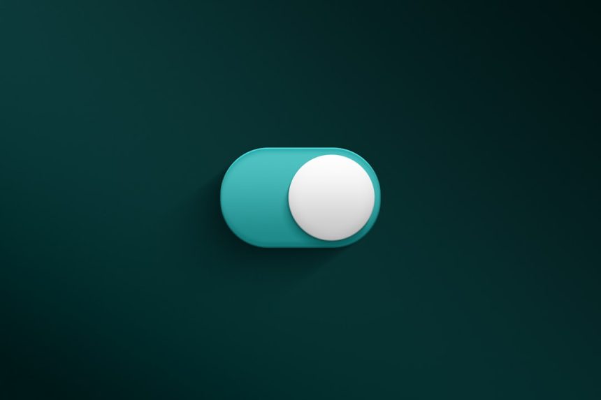
Pill buttons are buttons with fully rounded sides. They look like capsules. They are popular because they feel friendly and tappable.
Use pill buttons for strong actions. Things like Start now, Sign up, or Download. They work well when the button is short and bold.
But be careful. If every button is a pill, the design can feel too bubbly. It may lose structure. Long pill buttons can also look awkward. Like a hot dog in a business suit.
Use them with intention. Let them shine where it matters.
Radius Should Match Spacing
Corner radius and spacing are best friends. They should not fight.
If a card has a huge radius but tiny padding, it can feel cramped. The content may look trapped in a marshmallow. If a card has a tiny radius and lots of soft spacing, it may feel mismatched.
Here is a simple rule:
- Small components can use small radius.
- Large components can use larger radius.
- Soft layouts can use softer corners.
- Dense layouts should use tighter corners.
Look at the whole shape. Not just the corner. Good design is about relationships.
Use Nested Radius the Smart Way
Nested radius happens when one rounded shape sits inside another. For example, an image inside a rounded card.
The inner corner should usually be smaller than the outer corner. This keeps the spacing looking clean. If the inner radius is too large, it can look odd. If it is too sharp, it can feel unfinished.
A handy trick is this:
Inner radius = outer radius minus padding.
So if a card has a 16px outer radius and 8px padding, the image inside may use about 8px. It does not have to be perfect math. But it should look balanced.
Do Not Round Everything
Rounded corners are great. But too much of a good thing gets weird.
If every box, image, icon, popup, chart, and label is super round, the design may feel childish. Or sticky. Or like it was dipped in melted candy.
Contrast is useful. Some sharp edges can make rounded elements stand out more. For example, a clean layout with sharp section edges can make rounded cards feel special.
Use radius like seasoning. Not soup.
Think About Touch Targets
In mobile UI, rounded corners can make buttons feel easier to tap. But the real tap area still matters.
A cute rounded button is not enough if it is too small. Make sure buttons are large enough for fingers. A common target is around 44px tall or more.
Also, avoid making tiny icons inside giant rounded containers without reason. It can waste space. Balance the shape, label, and action.

Watch Out for Clipping
Images inside rounded containers need care. If an image fills a rounded card, make sure the image is clipped to the same radius. Otherwise, sharp image corners may poke out. Nobody invited them.
In web design, this often means using overflow: hidden on the container. In design tools, it may mean masking the image.
Also check shadows. A strong shadow on a rounded card should follow the shape. If the shadow looks square, the magic breaks.
Test Radius at Different Sizes
A corner radius that looks great on desktop may look too large on mobile. A tiny radius that looks fine on a big screen may disappear on a small one.
Preview your design in real sizes. Check buttons, cards, modals, and images. Zooming out is not enough. Open the design where users will actually see it.
Ask simple questions:
- Does this feel clickable?
- Does it match the brand?
- Does it feel consistent?
- Does it help the content?
- Is it calm, or is it too cute?
Best Practices to Remember
- Choose a clear radius scale. Keep it simple.
- Match radius to brand tone. Serious brands may need less curve.
- Be consistent. Similar elements should use similar radius.
- Use large radius for emphasis. Do not apply it everywhere.
- Check nested corners. Inner corners should feel balanced.
- Test on real screens. Size changes everything.
Final Thoughts
Radius corners may seem tiny, but they shape the whole feel of a design. They can make a screen feel friendly, polished, and easy to use. They can also make a brand feel playful, calm, modern, or serious.
The best approach is simple. Pick a few radius values. Use them with purpose. Match them to your content and brand. Then test them in real layouts.
Rounded corners are not magic fairy dust. But used well, they are close. They help your design smile without saying a word.