Creating a logo for a local service business sounds simple, right? Just slap the city’s skyline on it, toss in a famous bridge or statue, wrap it in a pretty color, and you’re done. Well… not quite. If you use the same clichés as everyone else, your brand won’t stand out. It’ll blend in—and that’s the last thing you want.
TL;DR: Local service logos should connect with the community but avoid overused city symbols. You can use landmarks creatively without being predictable. Focus on originality and emotional connection, not just geographical markers. There are better ways to say “Hey, we’re local!” than copying the city skyline again.
The Problem With Clichés
Let’s talk about the usual suspects in logo design: the skyline, the bridge, the courthouse dome. Sound familiar? That’s because every other company in town is using them too. These images are instantly recognizable—which makes them popular, but also makes your logo get lost in a crowded field.
- City skylines have been done to death.
- Iconic buildings feel worn-out in design.
- They don’t tell customers what you do, just where you are.
So how can you say “local” without shouting “me too”?
Be Inspired, Not Imitative
You don’t have to avoid landmarks altogether. The key is using them in a fresh and clever way. Think of them as a spice, not the whole meal.
Instead of the whole city skyline, isolate one element. Example: you could use the distinct curve of a bridge arch as part of a letter in your brand name. Or stylize a local statue into something abstract and modern.
Here are a few ways to rethink landmark use:
- Zoom in: Just a piece—even a window shape or rooftop line—can feel local.
- Stylize: Use abstract lines or negative space, not full-on sketches.
- Combine: Mix landmark elements with tools of your trade (like a wrench forming a tower).
Now, you’re referencing your city, but in a way nobody else does.
Say Local Without Showing It
Being local is more than showing the city’s face. It’s about feeling like you belong there. Use colors, fonts, and styles that speak to your area’s energy.
If your town is beachy and relaxed, go for calm blues and soft-round fonts. If it’s urban and fast-paced, maybe bold lines and sharper text say it better than a photo of City Hall.
Here are other ways to scream “local” without a landmark:
- Color palette: Match city sporting teams, flags, or neighborhood vibes.
- Tone of design: Fun and quirky? Or elegant and historic?
- Name plays: Use phrases or slang only locals get.
- Textures: Brick patterns, water waves, or leaf silhouettes tied to your area.
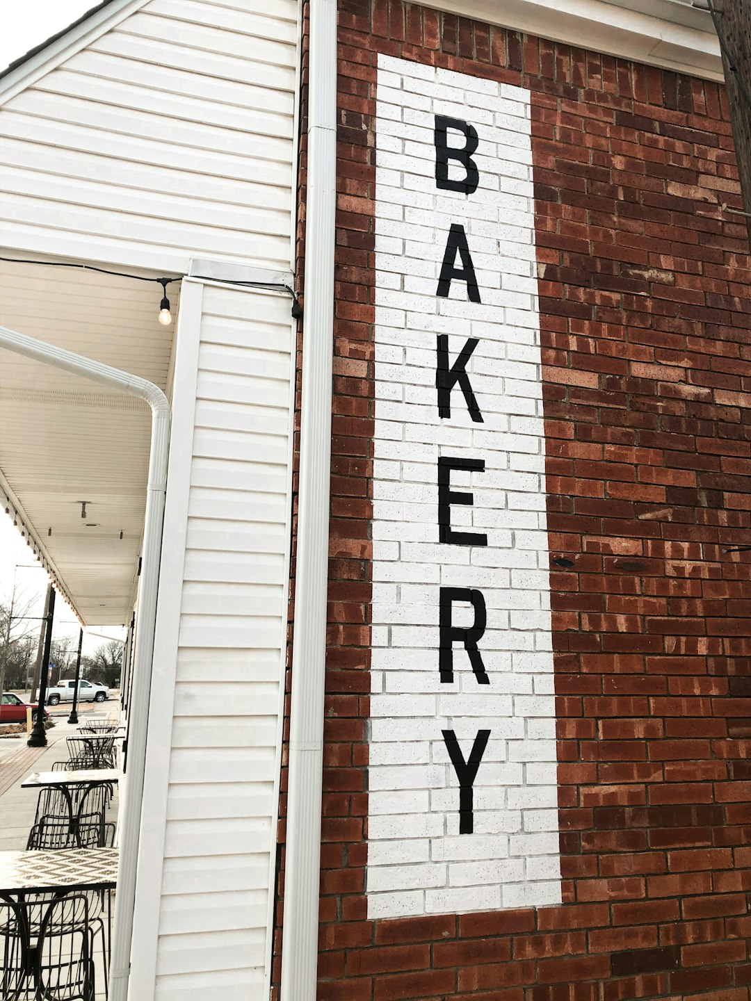
Feel the Culture, Not Just the Coordinates
Your city isn’t just buildings—it’s people. Use design to reflect community culture. What’s popular around town? Local food? Annual festivals? Music scene? Let these inspire your visuals.
One bakery used an old trolley shape—not because it was famous, but because everyone remembers riding it as a kid. That’s the kind of emotional landmark that builds real connection.
Case Studies: Winning Without the Obvious
1. Spark Cleaner – Austin, TX
Instead of the capitol dome, Spark used a vintage bootprint in their design—bringing in Austin’s cowboy roots. It’s unique and local, without feeling forced.
2. BlinkTech – San Francisco, CA
You’d expect the Golden Gate Bridge, right? Nope. They used curved shapes based on fog patterns over the bay. Still local. Totally original.
3. Brew Local – Asheville, NC
They incorporated mountain silhouettes inside a beer foam swirl. It’s smart, stylish, and tells you exactly what they’re about.
Dos and Don’ts
Here’s a quick cheat sheet:
Do:
- Use abstract versions of landmarks.
- Mix city inspiration with company purpose.
- Focus on feeling over fact.
- Speak with your colors and shapes.
Don’t:
- Use skyline silhouettes unless you have a new take.
- Copy competitors’ designs just because “that’s what everyone does.”
- Include too many elements just to show you’re local.
- Ignore culture in favor of geography.
Final Design Tips
When designing (or hiring a designer), ask these questions:
- What makes our city unique beyond its buildings?
- What do locals love, notice, remember?
- Can our logo feel truly local without needing a landmark?
- Does our business identity shine, or is it lost in local clutter?
Ask a few people not familiar with your city to look at your logo. Do they get what kind of business you are? Does the local reference even register? This test can help you know if you’re trying too hard—or just right.
Conclusion
Landmarks are landmarks for a reason—they’re special! But in logo design, too much familiarity can fade into background noise. Be creative. Be bold. Make your city proud in a way that’s you!
Your local roots matter. Just don’t bury them under another drawing of City Hall.


