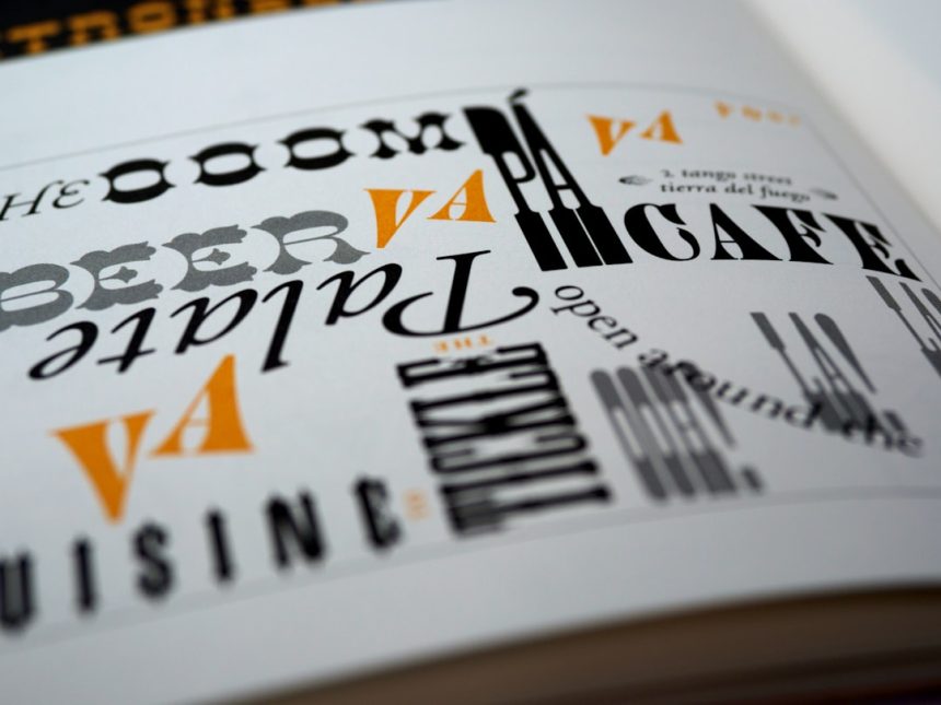
Typography is often described as the voice of visual communication, but its most subtle vocabulary lives in glyphs and symbols. These marks can guide attention, carry emotion, clarify meaning, and give a brand or publication a distinctive rhythm. In advanced design work, they are not decorative afterthoughts; they are functional elements that shape how information is read and remembered.
TLDR: Glyphs are the visual forms of characters, while symbols are marks that communicate meaning beyond ordinary letters. Designers use them to improve readability, create hierarchy, support branding, and add cultural or emotional nuance. Advanced typography depends on choosing the right marks, spacing them carefully, and using them consistently. When handled well, glyphs and symbols make design feel both precise and expressive.
What Glyphs Actually Are
A glyph is the visual representation of a character. The letter “a,” for example, is a character, but it can appear as many different glyphs depending on the font: a simple geometric form, a handwritten shape, or a traditional serif version with a curved terminal. The same idea applies to numerals, punctuation, ligatures, accents, arrows, and alternate letterforms.
Designers think about glyphs because a typeface is not only a set of letters. It is a system of visual decisions. A font may include small caps, stylistic alternates, swashes, fractions, mathematical marks, currency signs, and language-specific accents. Each glyph contributes to the tone of the final design.
How Symbols Differ from Glyphs
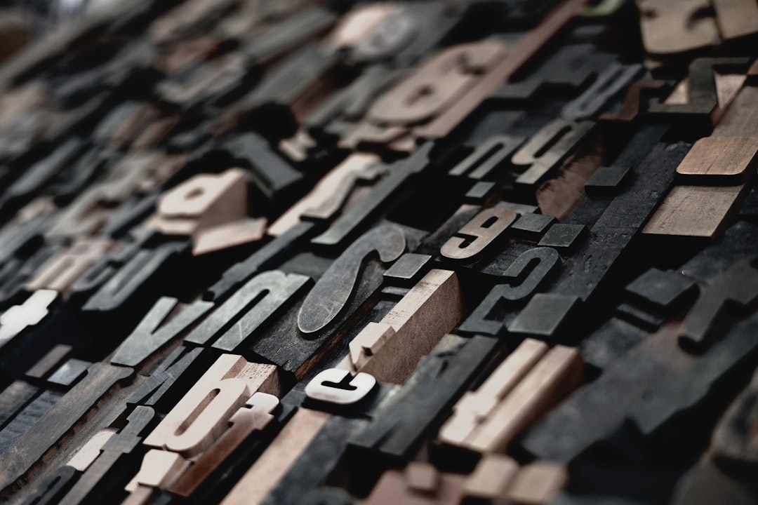
Symbols are marks that carry meaning through recognition, convention, or context. A heart can suggest affection, a magnifying glass can indicate search, and an arrow can point toward action. Some symbols are also glyphs within a font, but their purpose extends beyond representing a written character.
In design, symbols often serve as shortcuts. They help viewers understand a message quickly without reading a full sentence. A well-placed symbol can compress complex information into a small visual cue, which is especially useful in interfaces, signage, packaging, and editorial layouts.
Why Advanced Typography Uses More Than Letters
Advanced typography relies on the idea that every mark on a page has a job. Letters form words, but punctuation controls pacing, symbols guide behavior, and alternate glyphs fine-tune personality. Designers use these elements to build hierarchy, rhythm, contrast, and meaning.
For example, an elegant ampersand can become a central feature in a wedding invitation. A sharp arrow may make a technology interface feel fast and efficient. A carefully chosen bullet style can make a list look formal, playful, or editorial. These choices may seem small, but they influence the way a viewer experiences the design.
Common Glyphs Designers Use
Professional designers frequently explore the hidden parts of a typeface. These features can transform ordinary text into a more polished composition:
- Ligatures: Combined characters such as “fi” or “fl” that improve spacing and visual flow.
- Stylistic alternates: Optional versions of letters that add personality or refinement.
- Swashes: Decorative extensions often used in scripts, invitations, and luxury branding.
- Small caps: Capital letterforms sized to blend smoothly with lowercase text.
- Oldstyle numerals: Numbers with varying heights that sit naturally within body copy.
- Currency and mathematical glyphs: Specialized marks that support clarity in data-heavy design.
- Accented characters: Essential glyphs for multilingual communication and inclusive typography.
Symbols as Visual Navigation
Symbols help designers create visual navigation. In digital products, icons guide users toward search, settings, checkout, or sharing. In print, symbols may identify warnings, categories, page references, or calls to action. Their value comes from speed: viewers can interpret them almost instantly when the symbol is familiar and well placed.
However, symbols are not automatically universal. Cultural context matters. A hand gesture, animal, color, or religious mark may carry different meanings in different regions. Experienced designers test symbols for clarity and avoid assuming that every audience will interpret a mark the same way.
Spacing, Scale, and Alignment
Using glyphs and symbols well is not only about selecting attractive marks. Designers must also control spacing, scale, and alignment. A symbol that is too large can overpower text, while one that is too small may become unclear. An arrow that is slightly misaligned can make a layout feel careless, even if the viewer cannot explain why.
Advanced typography pays close attention to optical balance. Some glyphs appear heavier or lighter than their actual measurements suggest. Parentheses, quotation marks, icons, and punctuation often need manual adjustment so they feel visually centered. This is one reason typography remains a craft even in highly automated design environments.
Building Brand Personality with Glyphs
Brands often use glyphs to create recognition. A custom ampersand, a distinctive numeral, or a modified letterform can become part of a visual identity. These details help a brand stand apart without requiring a completely new typeface.
A luxury brand may choose refined ligatures and high-contrast punctuation to suggest elegance. A children’s brand may use rounded symbols and playful alternates to feel friendly. A technology company may prefer geometric icons and simplified glyphs to communicate clarity and modernity. In each case, typography supports personality before the audience reads a full message.
The Role of Unicode and OpenType
Modern typography depends on technical systems that allow designers to access thousands of glyphs. Unicode assigns a unique code to characters across languages and writing systems, making global digital communication possible. OpenType fonts can contain advanced features such as ligatures, alternates, fractions, superscripts, and multiple numeral styles.
These systems give designers broader creative control. Instead of being limited to basic letters and punctuation, they can choose forms that match context. A cookbook may use true fractions, a financial report may use tabular numbers, and a literary magazine may use oldstyle numerals for a more traditional reading texture.
When Decoration Becomes Distraction
Glyphs and symbols are powerful, but too many can create visual noise. A layout filled with swashes, icons, arrows, ornaments, and alternate characters may lose clarity. Advanced typography requires restraint. Designers usually ask whether each mark supports understanding, hierarchy, emotion, or brand identity.
The best use of decorative glyphs often appears intentional and limited. A single ornamental divider can separate sections elegantly. A special initial letter can introduce an article with drama. A unique icon set can support navigation without competing with the main content.
Accessibility and Readability
Responsible designers also consider accessibility. A symbol should not be the only way important information is communicated. Text labels, contrast, readable sizing, and consistent patterns help ensure that more people can understand the design. This is especially important in interfaces, public signage, and instructional materials.
Readability should guide every typographic decision. A beautiful alternate glyph may be unsuitable if it makes a word difficult to recognize. A clever symbol may fail if users must stop and decode it. Advanced typography succeeds when elegance and usability work together.
FAQ
-
What is the difference between a glyph and a character?
A character is the abstract idea, such as the letter “A.” A glyph is the specific visual form used to display that character in a particular typeface. -
Are icons considered symbols?
Yes. Icons are a common type of symbol used to represent actions, objects, or ideas quickly, especially in digital interfaces and signage. -
Why do designers use ligatures?
Ligatures improve the visual connection between certain letters and can make text appear smoother, more refined, and easier to read. -
Can glyphs affect brand identity?
Yes. Distinctive glyphs, custom letterforms, numerals, and symbols can help a brand look recognizable and communicate a specific personality. -
Should decorative glyphs be used often?
They should be used with restraint. Decorative glyphs are most effective when they support the message rather than distract from it.