Build your marketing around what people want right now, then make the next step stupidly clear. That is the heart of conversion-focused marketing. Not louder ads. Not prettier buttons. A strategy that turns clicks into customers needs five pieces working together: intent, messaging, landing pages, testing, and customer journeys.
TLDR: Conversion-focused marketing means matching each visitor’s intent with the right message, page, offer, and follow-up. For example, a SaaS company might send “pricing” search traffic to a comparison page and “how to” traffic to a guide, then see demo bookings rise from 3% to 6.5%. Small changes matter. A clearer headline, faster page, and stronger call to action can turn quiet traffic into real revenue.
Start with intent, not your product
Intent is the reason behind the click. It tells you what the person wants. It also tells you how ready they are to buy.
Some people are just browsing. Some are comparing. Some are clutching a credit card and muttering, “Please solve this problem before lunch.”
Your job is to sort them.
- Informational intent: “How do I fix this?”
- Comparison intent: “Which option is better?”
- Transactional intent: “Where can I buy this?”
- Urgent intent: “I need this fixed now.”
Do not send all of these people to the same page. That is how good traffic goes to die.
A person searching “best payroll software for small teams” wants proof and comparisons. A person searching “buy payroll software online” wants pricing, features, and a clear signup button. Treating them the same is like serving soup with a fork. Weird. Messy. Avoidable.
Match the message to the moment
Once you know intent, write the message. Keep it direct. Keep it human. Say what they get. Say why it matters. Say what to do next.
A weak message sounds like this:
“We provide innovative solutions for modern businesses.”
That says almost nothing. It could be about software. Or chairs. Or a very confident toaster.
A stronger message sounds like this:
“Cut payroll admin from 6 hours to 30 minutes a week.”
Now we have a result. We have a number. We have a reason to care.
Good conversion messaging has three parts:
- The pain: What is annoying them?
- The promise: What gets better?
- The proof: Why should they believe you?
Use customer words where possible. Not boardroom words. If customers say “I hate chasing invoices,” use that. Do not turn it into “accounts receivable workflow optimization.” Nobody talks like that at dinner.
Build landing pages with one job
A landing page should not be a museum. It should not show every feature, award, blog post, team photo, and office dog. Cute dog, yes. But later.
A conversion-focused landing page has one main goal. Book a demo. Start a trial. Download a guide. Get a quote. Pick one.
Here is a simple page structure that works:
- Hero section: Clear headline, short subtext, strong call to action.
- Problem section: Show you understand the pain.
- Solution section: Explain the offer in plain words.
- Proof section: Reviews, numbers, logos, screenshots, case studies.
- Action section: Repeat the call to action.
- FAQ section: Remove doubts before they become exits.
Speed matters too. It drives me crazy when a landing page takes five seconds to load because someone uploaded a hero image the size of a billboard. Those seconds cost money. People leave. Ads keep charging. Everyone gets grumpy.
Use simple forms. Ask for what you need now. Not their fax number, favorite sandwich, and life story. If the offer is small, the form should be small.

Make the call to action obvious
Your call to action should feel like the next natural step. Not a trap. Not a mystery button.
Use action words. Make the value clear.
- Weak: Submit
- Better: Get my free audit
- Weak: Learn more
- Better: See pricing plans
- Weak: Click here
- Better: Start my 14 day trial
Also, repeat the button. Put it near the top. Put it after proof. Put it at the end. People decide at different speeds. Give them a button when they are ready.
Test like a curious raccoon
Testing is where guesses get humbled. You may love a headline. Your audience may ignore it like a gym membership in February.
Test one main thing at a time when possible. If you change the headline, image, offer, and form all at once, you learn very little. You only learn that “something changed.” Helpful? Not much.
Good things to test include:
- Headlines
- Calls to action
- Form length
- Hero images
- Pricing layouts
- Testimonials
- Offer types
Watch the right numbers. Clicks are nice. Conversions are better. Revenue is best.
Track these:
- Conversion rate: What percent take action?
- Cost per lead: How much does each lead cost?
- Lead quality: Do these leads become customers?
- Drop off points: Where do people quit?
- Page speed: How fast does the page load?
If 1,000 people visit and 20 convert, your rate is 2%. If a new headline gets 35 conversions from the same traffic, that is 3.5%. That little lift can mean a lot when ad spend grows.
Design the full customer journey
The conversion does not always happen on the first visit. Shocking, right? People compare. They get distracted. They open 19 tabs. Then they forget why they opened them.
Your customer journey should help them return and decide.
Map the path from first click to final sale:
- Awareness: They discover the problem or your brand.
- Interest: They read, watch, or compare.
- Decision: They check proof, pricing, and fit.
- Action: They sign up, call, buy, or book.
- Retention: They get value and stay.
Each stage needs different content. A beginner may need a guide. A warm lead may need a case study. A ready buyer may need a discount, demo, or clear guarantee.
Use follow up without being annoying
Follow up is powerful. It can also get creepy fast.
If someone downloads a guide, send helpful emails. Share tips. Show examples. Offer a next step. Do not send seven “just checking in” emails that sound like a robot tapping on the window.
A simple follow-up flow might look like this:
- Email 1: Deliver the resource.
- Email 2: Share a quick win.
- Email 3: Show a customer result.
- Email 4: Invite them to book a call or start a trial.
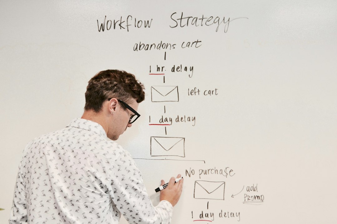
Retargeting can help too. Show ads based on what someone viewed. Pricing page visitors may need a demo offer. Blog readers may need a guide. Cart abandoners may need a reminder or free shipping.
Keep the strategy simple
Conversion-focused marketing is not magic. It is alignment.
The ad matches the intent. The message matches the pain. The page matches the promise. The test improves the result. The journey keeps helping after the first click.
Start with one campaign. Pick one audience. Choose one offer. Build one focused landing page. Then measure what happens.
If results are weak, do not panic. Check the basics first. Is the traffic right? Is the offer clear? Is the page slow? Is the form too long? Is the button buried like treasure?
Fix those before chasing fancy tools.
The best conversion strategy feels simple to the customer. They arrive, understand, trust, and act. No confusion. No friction. No soup forks.