Bevel and emboss sounds fancy. It sounds like something a tiny royal stamp would do. But it is really simple. It is the art of making flat text or buttons look raised, pressed in, shiny, soft, or carved.
TLDR: Bevel and emboss effects use light and shadow to make text and UI elements look more real. A good effect is usually subtle, not loud. Pick one light source, keep shadows soft, and match the effect to the style of your design. Use it to guide the eye, not to show off every slider in the menu.
What is bevel and emboss?
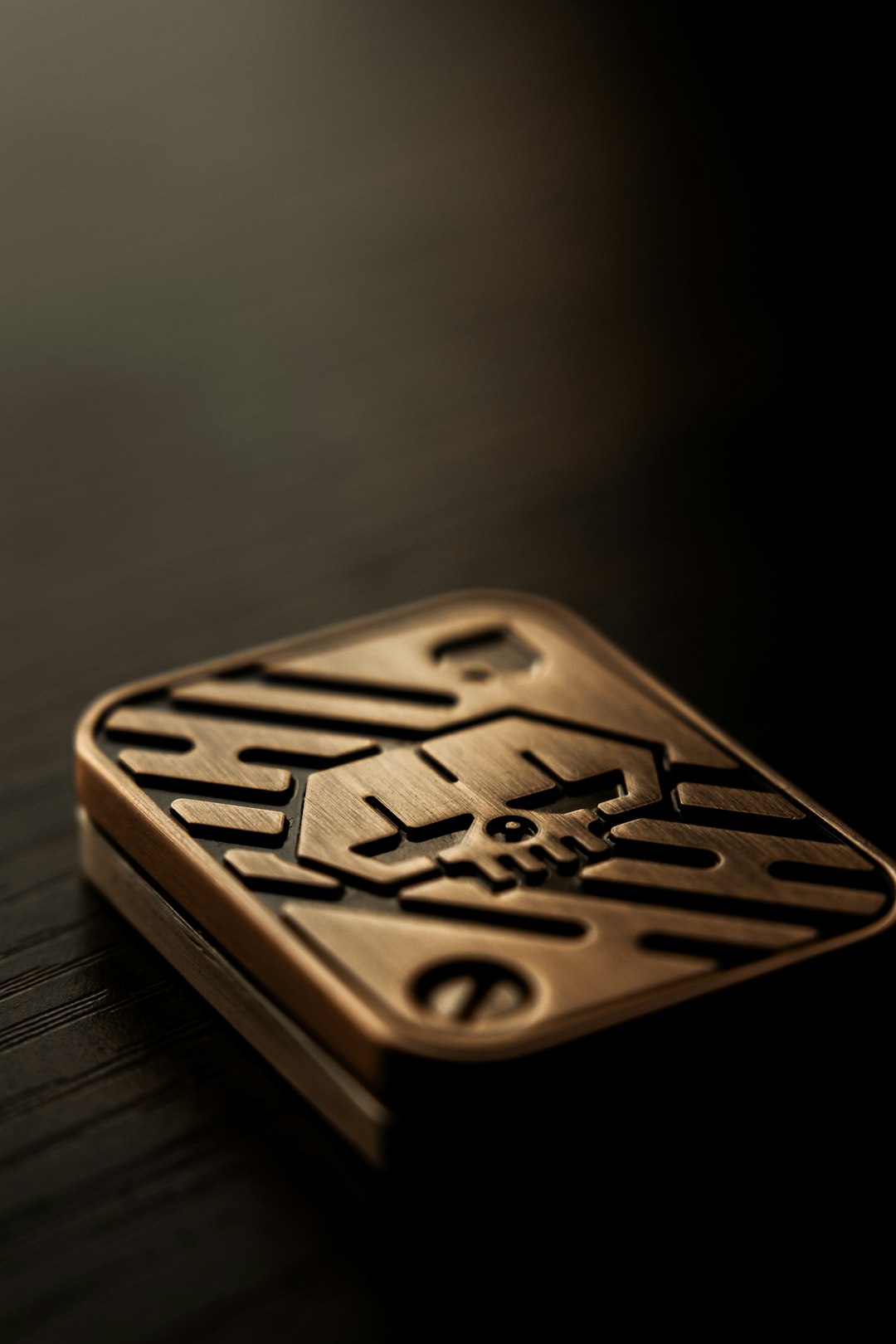
A bevel is a sloped edge. Think of the edge of a coin, a badge, or a chocolate bar square. It catches light on one side and shadow on the other.
Emboss means the shape looks raised from the surface. The opposite is often called deboss. That means the shape looks pressed into the surface.
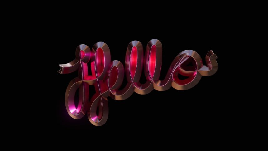
When you combine bevel and emboss, you create a fake 3D effect. Your text can look like metal, plastic, leather, glass, paper, or candy. Yes, candy. Design is better with snacks.
Why does it work?
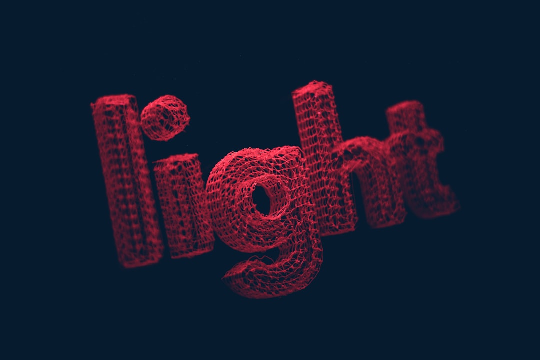
Our eyes love clues. Light on top tells us something is sticking out. Shadow below tells us it has height. A dark inner edge can make something look carved in. A bright inner edge can make it look raised.
That is the magic. No real 3D is needed. Just smart highlights and shadows.
Here is the simple rule:
- Highlight = the side facing the light.
- Shadow = the side facing away from the light.
- Soft edges = smooth material.
- Hard edges = sharp or polished material.
- Low contrast = elegant.
- High contrast = bold, game like, or retro.
Start with the light source
Before you touch any setting, choose where the light comes from. Top left is the classic choice. It feels natural because people are used to seeing light from above.
Once you choose it, stay loyal. Do not put a highlight on the top left of one button and top right of another. That makes the page feel odd. The user may not know why. But their brain will make a tiny frown.
A good light source keeps the whole design together. It is like a tiny sun for your interface.
Use bevel and emboss on text
Text is tricky. It can become messy fast. The goal is to make letters look rich, not crunchy.
For professional text effects, start small:
- Use a small bevel size.
- Keep the depth moderate.
- Use a soft shadow.
- Avoid bright white highlights on every edge.
- Check if the text is still easy to read.
Large display text can handle more drama. A logo, title, or poster headline may look great with a strong bevel. Small body text cannot. If your paragraph looks like it was carved from chrome, please let it rest.
Good uses for embossed text include:
- Badges and seals.
- Game titles and fantasy headings.
- Luxury logos with metal or leather looks.
- Packaging where texture matters.
Use bevel and emboss in UI design
Buttons, cards, sliders, and icons can all use bevel and emboss. But modern UI likes clean design. So be gentle.
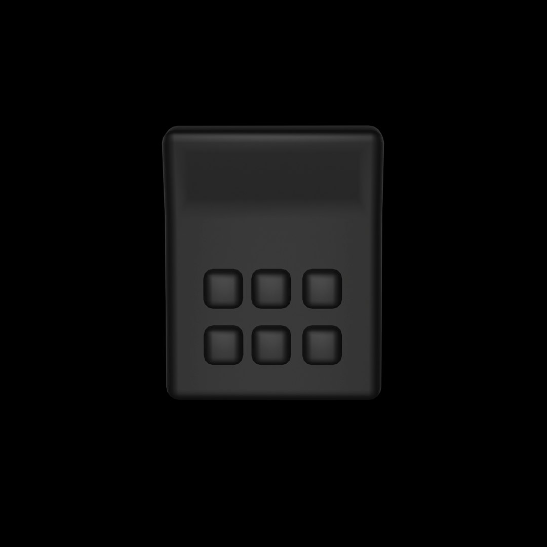
A button can look clickable with just a slight raised edge. Add a light top edge. Add a soft shadow under it. Done. Your button says, “Tap me.” It does not scream, “I was made in 2004.”
For a pressed button, flip the idea. Make the top edge darker. Put a soft highlight inside the bottom edge. Now it looks pushed into the surface.
Try this simple UI recipe:
- Start with a flat rounded rectangle.
- Add a light line at the top.
- Add a darker line at the bottom.
- Add a soft outer shadow.
- Lower the opacity until it feels natural.
That last step is very important. Most bevel effects look better at half power. If the effect looks amazing at first glance, lower it anyway. Professional design often whispers.
Pick the right material
Bevel and emboss can suggest different materials. You only need to adjust the edge, shine, and color.
- Metal: sharp bevels, strong contrast, cool highlights.
- Plastic: smooth bevels, gentle reflection, bright color.
- Glass: bright highlights, soft shadows, low fill opacity.
- Leather: dark embossing, texture, low shine.
- Paper: very soft shadows, tiny depth, natural colors.
Do not mix too many materials in one design. A metal title, glass button, leather card, and paper icon can look like a garage sale. Pick a mood. Then support it.
Common settings, in plain words
Most design apps use similar controls. The names may change, but the idea stays the same.
- Style: raised, inner, outer, or carved look.
- Depth: how strong the 3D effect feels.
- Size: how wide the beveled edge is.
- Soften: how blurry or smooth the edge becomes.
- Angle: where the light comes from.
- Altitude: how high the light sits.
- Highlight mode: the bright part of the edge.
- Shadow mode: the dark part of the edge.
If you feel lost, use this beginner formula:
- Angle: 120 degrees.
- Altitude: 30 to 45 degrees.
- Depth: low to medium.
- Size: small for text, medium for buttons.
- Soften: a little, not too much.
Make it readable first
Cool effects are fun. But users still need to read and click. If bevel and emboss hurts readability, it is not helping.
Check your design at different sizes. Zoom out. View it on a phone. Squint at it. If the letters turn into shiny noodles, reduce the effect.
Also watch your contrast. Light text with bright highlights can disappear. Dark text with heavy shadows can feel muddy. Keep the main letter shape clear. The effect should decorate it, not fight it.
Layer effects for a richer look
A bevel alone can look flat. Add a few small helpers.
- Drop shadow to lift the object from the background.
- Inner shadow to create a carved look.
- Gradient overlay to make material feel less flat.
- Texture to add grit, paper grain, or fabric feel.
- Stroke to define the outline.
But do not add everything at once. Effects are like spices. A little makes the soup great. Too much makes people ask questions.
Watch out for these mistakes
- Too much depth: The design starts to look cheap.
- Wrong light direction: Elements feel mismatched.
- Huge bevel on small text: Letters become hard to read.
- Pure black shadows: The result feels dirty and harsh.
- Pure white highlights: The shine can look fake.
- No purpose: The effect is there only because it can be.
Instead, use softer colors. Try dark gray instead of black. Try warm cream instead of white. These tiny choices make the effect feel more polished.
A simple practice project
Try making a raised “Start” button. Use a rounded rectangle. Give it a blue fill. Add a soft top highlight. Add a darker bottom edge. Add a small drop shadow. Then add the word “Start” in white with a tiny bevel.
Now make the pressed version. Darken the button. Move the shadow inside. Lower the top highlight. This gives you two states: normal and active. That is real UI thinking.
Next, try the same idea with a title. Make the letters large. Add a small bevel. Add a gentle gradient. Place it on a textured background. Keep checking the readability.
Final thoughts
Bevel and emboss is not old or new. It is just a tool. Used badly, it looks loud. Used well, it adds touch, depth, and charm.
The secret is simple. Choose one light source. Keep the effect subtle. Match the material. Protect readability. Then let your design shine, but not like a disco ball unless that is the plan.
Now go make some buttons pop and some letters glow. Just remember: if your text looks like a golden inflatable sofa, maybe turn the depth down.