A branded LinkedIn banner is an important aspect of your company’s profile on the professional social network. It can help you make a great first impression on potential customers, clients, and partners. In this article, we will provide seven winning tips for creating a branded LinkedIn banner that effectively represents your brand and attracts the attention of your target audience.
1. Use High-Quality Visuals
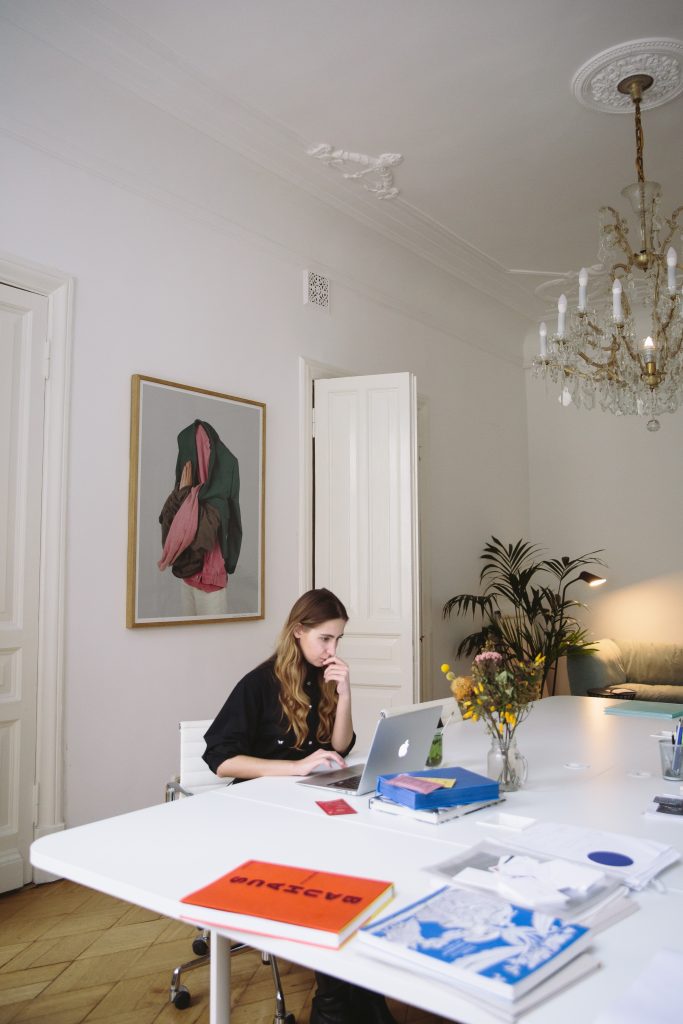
The first and most crucial aspect of a branded linkedin banner is high-quality visuals. Your banner image should be visually appealing, high-resolution, and relevant to your brand. You can use your brand colors, typography, and imagery to create a cohesive visual identity that aligns with your overall brand image.
2. Keep it Simple and Uncluttered
A cluttered LinkedIn banner can distract and confuse your target audience. That is something you want to avoid at all costs. Keep your banner design simple, clean, and uncluttered. Use white space effectively and avoid using too many elements or too much text in your banner design. This will help your banner stand out and make a strong impression on viewers.
3. Highlight Your Brand Values and Messaging
Your LinkedIn banner is an excellent opportunity to showcase your brand values and messaging. Use your banner design to highlight your brand’s unique selling proposition, key benefits, and brand personality. This will help you create a strong brand identity and differentiate your brand from your competitors.
4. Incorporate Your Logo
Your logo is an essential element of your brand identity, and it should be prominently featured in your LinkedIn banner. Make sure your logo is clear, legible, and visible on your banner design. You can also experiment with different logo placements and sizes to find the right balance that works for your brand. Adobe Express has a lot of professional logo templates you can use to create anything you need for your business.

5. Consider Using Visuals that Represent Your Industry or Niche
If you want to make your LinkedIn banner more relevant to your target audience, consider using visuals that represent your industry or niche. For example, if you are a software development company, you can use imagery related to technology or coding in your banner design. This will help your banner stand out and attract the attention of potential clients and partners.
6. Keep Mobile Viewers in Mind
LinkedIn is accessed by a significant number of users on mobile devices. As such, it is crucial to create a banner design that is mobile-friendly and can be easily viewed on smaller screens. Keep your design simple, and avoid using small text or elements that may be difficult to see on a smaller screen.
7. Test and Iterate
Finally, it is essential to test and iterate your LinkedIn banner design. Monitor how your banner performs over time and experiment with different elements to find the right balance that works for your brand. You can also ask for feedback from your target audience to help you refine your banner design and create a strong visual identity for your brand on LinkedIn.
In conclusion, a branded LinkedIn banner is an essential element of your company’s profile on the professional social network. By using high-quality visuals, highlighting your brand values and messaging, incorporating your logo, and considering the mobile experience, you can create a winning LinkedIn banner that effectively represents your brand and attracts the attention of your target audience. By testing and iterating your design, you can refine your banner and create a strong visual identity that helps your brand stand out in the crowded world of LinkedIn.
